 Company logos are essential elements of any marketing strategy, and they often give potential customers their first impressions of a business. For those impressions to be positive ones, savvy business owners put some time and thought into a great logo that stands out. The best logos are memorable but still follow some basic fundamentals of graphic design. In both print media and web-based advertising, a great logo has the right combination of typography, balance, color and finish.
Logo Fonts: Clarity is Key
Newcomers to logo design often make the mistake of selecting a logo font with scripting, swirls and other fancy type in hopes it will send a memorable message about the given company. These fonts are actually difficult for many people to read clearly, and some may even interpret the organization’s name as something completely different. Since more potential buyers now view business websites and other marketing materials on mobile browsers, a fancy logo font is even more challenging to read on a small screen.
Selecting a simple, clear logo font is considered a best practice in the graphic design world. A number of designers stick with sans-serif fonts, such as Arial or Helvetica. Others use serif fonts with only small serifs on the ends of each letter, and this font choice simplifies the process of kerning. In typography, kerning entails making minute adjustments to the spacing between each letter for maximum visual balance.
Design Elements: Use of Space Matters
A well-balanced logo makes the best possible use of positive versus negative space with the lettering, graphic elements, colors, borders and any other artistic elements a business owner wants to include. Observers normally notice visual balance on an unconscious level, but this aspect of a logo can still form impressions of an organization in their minds. Too much use of blank space without a design purpose can lend the idea that a business with a careless logo design may be careless in other aspects as well. Too little symmetrical space between graphics or lettering can have a similar unfavorable effect.
Logo Color Choices
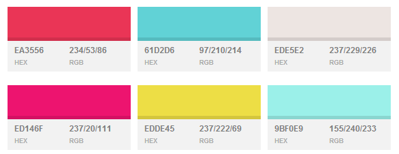
Color is one of the more intense areas of debate among graphic designers. Some maintain that bright, eye-popping colors have no place in a professional company logo. Others believe bright colors can be used sparingly if they are balanced well with the rest of the logo design. Still other graphic designers insist that bright colors are instrumental in making an impression that observers will remember, and they also believe that whether each person likes a selected color is a matter of subjective taste.

The best plan for using color in a logo is one that considers a business’s target audience demographics. A company that markets products for a younger, trendier crowd can get away with using vivid logo colors, such as orange, bright green or intense purple. Another company that markets primarily to a somewhat older, more conservative demographic is better off sticking to neutral or classic logo colors.

Due to the prevalent use of both print media and web advertising, business owners designing a logo also need to consider how different a finished logo will appear on screens versus paper. Adding special effects such as metallic or satin finishes to lettering may look appealing in a graphic design software work space, but much of these effects can get lost when the same logo is printed out. Sticking to a “less-is-more” design approach will prevent this issue and result in a great logo that looks professional both digitally and in print. The same concepts applied to font choices, spacing and color will guide entrepreneurs in creating the best possible company logo.
There are no small jobs, only great work. Create a new logo tailored to your target audience. We can educate you about design trends in your industry and create a fresh look for your company.
Call Toll Free: 1.877.847.8473
Get a Quick Quote here. View our logo portfolio here.
